Making production-ready illustrations from raw document scans
SOFTWARE: Photoshop (beginnner difficulty).
Catchy title, I know.
Public domain illustrations are one of the greatest tools in an indie publisher/writer’s arsenal, but if you don’t know where to find them or how to make production-ready files from them, then they’re not going to do you much good.
After being asked to make some of the illustrations used in Masque of the Red Death (and others) available to potential Gothic horror adventure writers, I released the Gothic Earth Art Pack for DMs Guild Creators. It’s a collection of 134 images curated from various public domain image publications and image libraries, cleaned up and ready to be used in production files (and, in a few cases, retouched a little to change the content).
But these images aren’t going to be enough for every book. So this post provides a basic run-down of the process I went through to find, convert, clean up, and prepare files to use in Masque of the Red Death, so that you can use it to find other illustrations and have them look as good as possible.
This is not a one-click process, but anyone with a basic understanding of how to use Photoshop should be able to follow along. If you’d like any clarifications, just ask me on Twitter.
What are public domain images?
Public domain images are images where the copyright has expired, not been renewed, or deliberately released to the public domain. More on that here: https://fairuse.stanford.edu/overview/public-domain/welcome/
But the not-comprehensive short version is that any work whose first authorized publication date was before 1923 (1924 once the calendar tips over to 2020) is public domain in the US.
How can I use public domain images?
You can use public domain images however the hell you want to. That is literally the point of the public domain.
You can modify them, remix them, combine them, collect them and release them in an art pack, whatever (but so can everyone else). The public domain is awesome.
While you don’t need to credit anyone when using public domain images, it’s considerate to do so whenever possible. I like to support the work of the archives I use by crediting them, as well.
Where can I find public domain images?
The three main online archives that I used for Masque of the Red Death are:
The Internet Archive — Not everything in the Internet Archive is public domain, but a lot of it is. So be careful to make sure that it’s marked as being public domain. I used the Internet Archive extensively for my MFA thesis project (Turn Out the Star When You Leave) and Masque of the Red Death.
- Frank Leslie’s Illustrated Historical register of the Centenniel Exposition, 1876 has tons of great illustrations. I included a few of them in the art pack; I think one or two ended up in Masque.
- Frank Leslie’s Illustrated Newspaper has several volumes with many wonderful illustrations. (Here’s one collection of them.)
- The Johnstown Horror documents a real-life flood and has several harrowing images of disaster and tragedy. (Some people may by uncomfortable with the idea of recontextualizing images like this for fictional purposes. I would hesitate to do that with photographs, myself, but illustrations seem already one step removed from the events.)
- The Strand has dozen of volumes on the Internet Archives, some of which are available in a couple of versions. The Strand included loads of adventure and mystery stories (including some of the original Sherlock Holmes stories, illustrated by Sidney Paget) but it also published a lot of weird “human interest” stuff, which are great for buildings and scenes of everyday life. This collection (which I don’t think is comprehensive) has fairly high quality scans; I’ll talk more about that later.
Old Book Illustrations — Everything on OBI is public domain (to the best of their knowledge, of course). It’s a great resource, but I would caution against using anything but their raw scans. Some of the settings they use to create their lower res images are a little overzealous, particularly when it comes to line art. (One size fits all settings are rarely better than “close enough.”)
The Library of Congress Digital Collections — This collection unfortunately doesn’ t let you sift out historical photos when you search for drawings, but there’s a lot of great stuff.
The British Library archive on Flickr — Everything here is public domain (at least in the UK and the US). Note that only this archive is public domain. The British Library also has separate image archives that include non-public domain images. So don’t go wandering over into their Images Online section and using stuff.
Uh… so what do I download?
I’m sure you don’t need me to explain how to search a website, so let’s say you’ve found an illustration you like, or a magazine you want to poke through. Now what? What you don’t want to do is just download the image on the page.
For instance, you can right-click images in the PDF viewer on the Internet Archive to download a single page as a JPG—but this is almost never the highest quality version of that image available. And on the Old Book Illustration website, while they have lower res versions in multiple sizes that have been cleaned up to some extent, if you know what you’re doing, you can always get better results. Which brings us to the point of this tutorial…
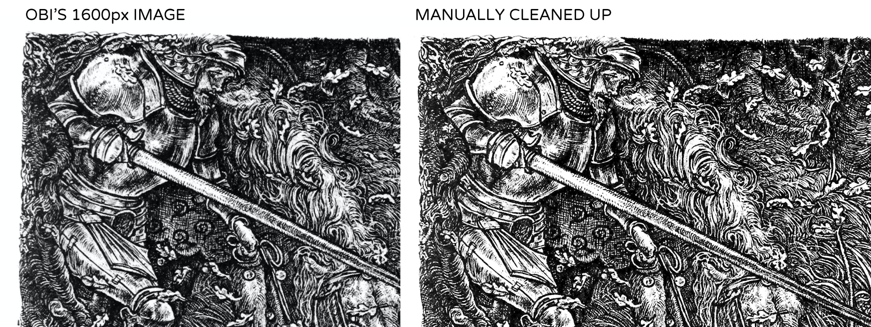
For most of this tutorial, I’m going to use this illustration from Old Book Illustrations.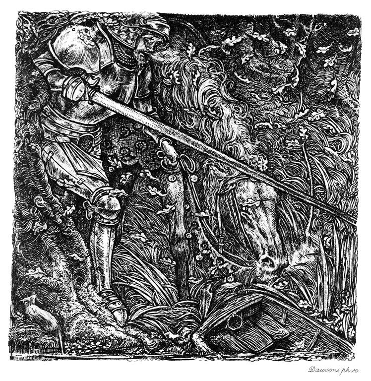 Now, this image (the 1600 px version) is pretty good. But we also have the raw scan available. So I’m going to download that instead.
On the Internet Archive, people name the files all kinds of weird shit, but look for the largest file size. For The Strand, vol. 48, for instance, that’s the “single processed JP2” one. Sometimes they’ll include “raw” or “original” in the file name instead (i.e. “single page original JP2”). You want the biggest, least processed version you can find.
Crop it!
The first step is straightforward: crop your image with the Crop tool. I want to eliminate most of the white border and the writing at the bottom right, and deleting a border is faster than cleaning it up. For some illustrations, you may also want to use the Polygonal Lasso tool (and the Delete key) to get rid of any text or image captions you don’t want.
Remove the paper background for black and white illustrations
This is our raw scan:
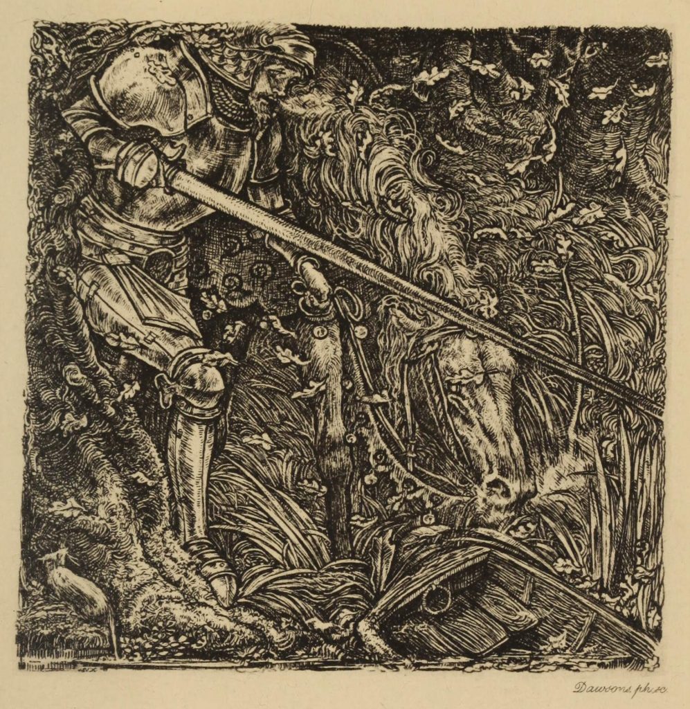
To remove the paper background do the following:
- In your Channels menu, identify the channel with the greatest contrast and select it by clicking on it. Since old paper yellows, that will most likely be the Red channel. (It’s hard to explain why and not very important.)
- Convert the image to the Grayscale image mode (Image / Mode / Grayscale). This changes the image to grayscale and discards the other channels. [Previously, I copied and pasted the contents of this channel, then converted to gray and flattened it, but Nat Gertler offered up this shortcut. Thank you, Nate!]
If your background is not pure white, you will need to correct for that next. Either the Levels or Curves commands are good for this, but I think Levels is easier.
- Open the Levels adjustment (Images / Adjustments / Levels in the menu) and use the Eyedropper to set a Color Sampler for white by Shift-clicking on an area of the illustration that should be white. This will update the Info panel with color information for that point, so you can adjust your levels precisely. (NOTE: You can also use a Levels adjustment layer to do this non-destructively!)
- Slide the light (right) pointer to adjust the white point. You can see on the right side of the image below, it says 14 /0%, indicating that the image was originally 14% Black/Gray but with the white point, it is now zero (a.k.a. white).
- Next, do the same for the black point (the left pointer). Slide it in until you the black areas of the illustration look solid. This gets subjective, but I like to leave a little noise/texture in the black areas, particularly for “period” books; it makes them look older. You also don’t want to be too heavy-handed with setting your black, because it will cause the darker areas to fill in and lose detail.
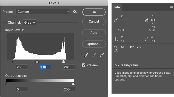
- Finally, adjust the middle point to get a good overall balance between light and dark in the image. This is also pretty subjective; either pick whatever looks good to you or whatever you think accurately reflects how the raw scan looked. If you’re going to multiply your image on top of a new page texture (like a parchment background in most D&D books), you might want to err on the lighter side.
Note that the input levels you need will likely vary with every image.
So this is where our image is now:
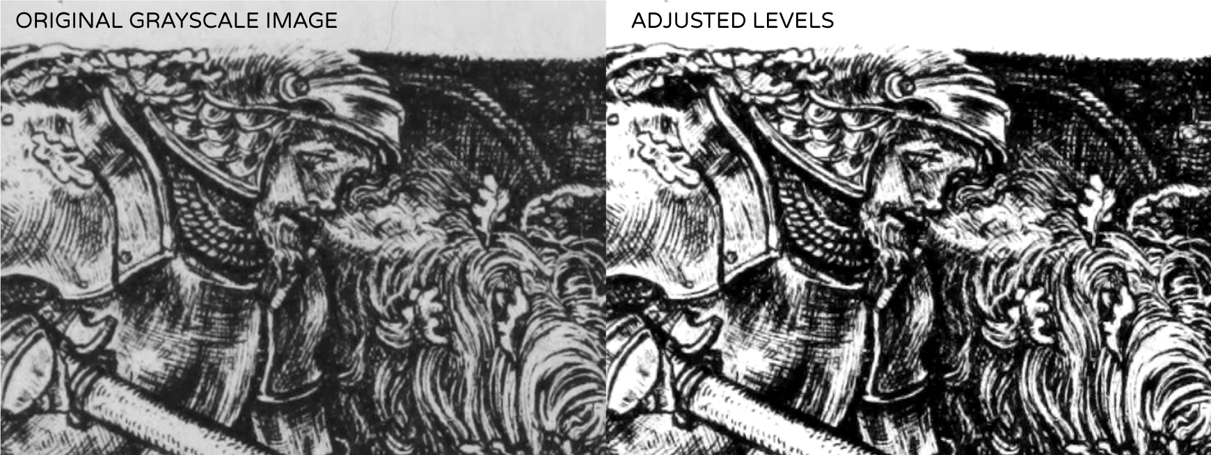
Much better! You can see a hair above the knight’s head has disappeared, but there’s still a speck of… something… at the top left. Sure, you can leave these things, but that’s lazy, so there’s more work to do.
NOTE: Removing backgrounds from full-color images is possible, but also harder. If people are interested, I can try to do another tutorial about that, but it would be more advanced.
Change your resolution to 300 dpi
This is not strictly necessary, but as an old-school print production artist, I prefer to make all my images 300 dpi (Image / Image Size). Make sure to have Resample unchecked so this does not actually alter the image.
This lets you know exactly how big the image is while you’re working, so you don’t spend a lot of time fixing tiny things that will disappear. (This image is about 5.9″ square at 300 dpi, which is pretty big! If I’m using the entire illustration in a PDF-only ebook, it will probably be reduced significantly. At 150 dpi, that’s 11.8″, and my live area for an 8.5″ × 11″ page is well under that.)
Straighten the image (if necessary)
Not all images need this step, but if you’re placing a square or rectangular illustration into your layout and the illustration or its border are distorted, it’s going to look weird.
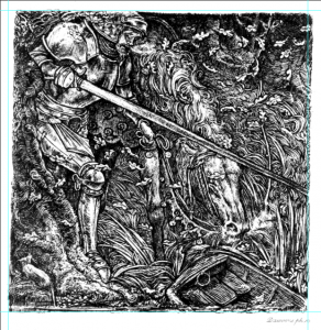
At a glance, this illustration looks square, and you might be fine with it as it is, but it’s actually pretty crooked. These kinds of distortions usually can come from the page not being totally flat when it’s scanned, a dodgy scanner, or a sliiightly crooked camera if they used a copy stand instead of a scanner. It’s also possible the original illustration is actually just that crooked. Who knows? But it doesn’t matter; you’re making a book, not digitally preserving a historical artifact. You can take liberties with this stuff for aesthetics if you want.
- Place four guides on your image by dragging down/over from the rulers, and it is obvious how skewed this is:
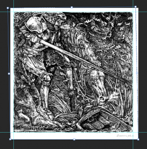
- Use the Free Transform tool (Cmd-T) to straighten this out. You might need to zoom in close to each corner to get this perfect.
What if my image is too small?
Hypothetically, if your image is too small there are some more advanced tricks to coax a few extra DPI from an image, but they’re a little out of scope for this basic-level tutorial. (Perhaps another time.)
However… Pixelmator Pro has a new feature called ML Super Resolution, which uses machine learning to intelligently blow up images. In my tests, it’s better with full color/photographic images than with line art, but you can easily double the resolution of an image with little to no loss of image quality. I’m saying this as an experienced photo retoucher who strongly discouraged clients from “up-rezzing” small images for decades: it’s damned impressive.
I ran the image through ML Super Resolution (a one-click process) and it came up with this. Supposedly, the image at the right is 900 dpi (at the same physical dimensions), but it does look a little blobby if you zoom in closely, so I would only use it about half that size. Still, it’s noticeably sharper, and their machine learning is only going to improve. It’s a really interesting tool to keep in your back pocket, for when you really need an image to be a liiiittle bigger. (Unfortunately, Pixelmator Pro is also $40, but for those of you looking for an alternative to Photoshop’s subscription model, it’s a great option.)
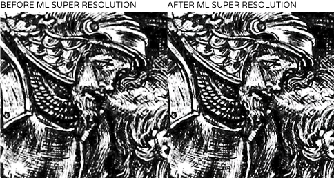
And again, because the image looks a little blobby, and our photo is already nice and big, I’m not going to use the ML Super Resolution version.
Sharpening a slightly blurry image
There are a lot of ways to sharpen images, and most of them get pretty heavy-handed. I prefer to use a lighter touch for this kind of thing, and sometimes simply running the Sharpen filter will do it. Especially with line art, if you try to sharpen up a fuzzy image too much, the artifacts that introduces can get pretty harsh.
For more advanced users, the Photoshop User Guide covers the other sharpening features very well. Unsharp Mask and Smart Sharpen can both yield excellent results, with finer control over the parameters. But understanding those parameters and how to set them gets tricky, so again, this area starts to get out of scope for a basic-level tutorial.
We’ll stick with our version here, which just used the Sharpen filter (once): it’s a one-click process (Filter / Sharpen / Sharpen).
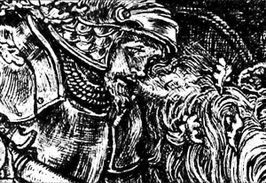
So here is the final image…
I did a little extra clean-up for this image, but it was pretty clean to begin with, so I wanted to use a different image to talk about manual clean-up below. Let’s jump forward a bit, to the final image:

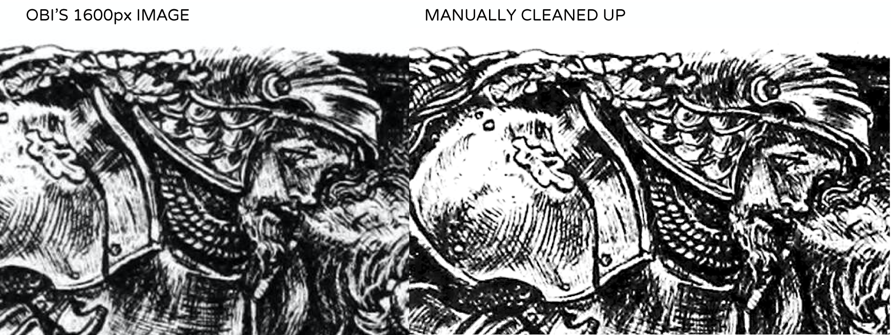
For comparison, here is the 1600px version that OBI provided next to our manually cleaned up version. In addition to being straightened (though that’s hard to tell here), the image is obviously noticeably sharper and has better detail in the shadows.
And here’s a close-up:
Download the original from here: https://www.oldbookillustrations.com/illustrations/knight-wood/
Compare it to the manually cleaned up version here: https://www.dropbox.com/s/1o0x7r89j27h3xt/knight-wood-cleaned%20up.psd.zip
(Oh, and by the way: if anyone wants to use this cleaned-up version of the image in a book, be my guest. Please credit Old Book Illustrations and the illustrator, Charles S. Ricketts.)
Additional Manual Clean-up/Restoration
I didn’t need to clean up the above image much, but no matter how good your Levels settings were, you’re going to have a little bit of noise or dirt, a blob of ink (or maybe a space where ink probably should be but isn’t)—maybe even a hair or two. Some lines might have fallen out, some thin spaces might have filled in. Remember, ink is a liquid, and printing is an organic process.
So the image in these files—scans of one hundred year old pieces of paper—isn’t necessarily a 100% accurate representation of the actual artwork, if that makes sense. Sometimes it can be hard to tell what’s noise, or dust, or actually part of the art, but it’s okay to take a few guesses as to the artist’s intent (and, again, to take a few liberties with it, if you need to).
Your main tools for this are pretty basic:
- Generally speaking, most of the touch-ups you’ll want to do will be with a 100% hard round brush and 100% white, to clean up the white areas (remove noise, dust and speckles).
- The Spot Healing Brush (with Content Aware fill) does a good job of fixing weird bits in areas with crosshatching, stippling, or dot patterns. You can also use the Cloning brush, but it’s slower.
- In places where a line or two have fallen out, just… drawing over it with a pressure-sensitive, black, round brush is your easiest best option. (It helps to have a graphics tablet for that kind of thing.)
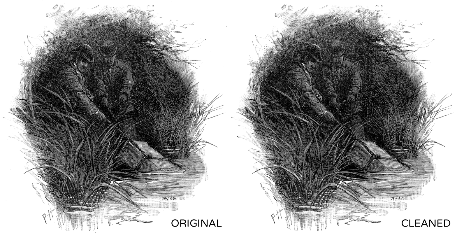
After spending a few minutes panning around this image (from The Strand vol. 27), here is the before/after:
(This image as downloaded from the Internet Archive already had the paper backgrounds removed.)
There’s certainly more I could do to the image, of course! But the smallest or lightest bits of noise are often fine to leave in if you’re planning to set the image to Multiply on top of a parchment background like in a lot of DMs Guild titles; it will just disappear in the parchment texture. And if you’re printing an image at smaller than actual size, some noise will get so small that it disappears.
Hopefully this helps! Again, if you’d like any clarifications, just ask me on Twitter. I’m happy to clarify, correct, or expand on this post where needed. (I already have, numerous times!)
